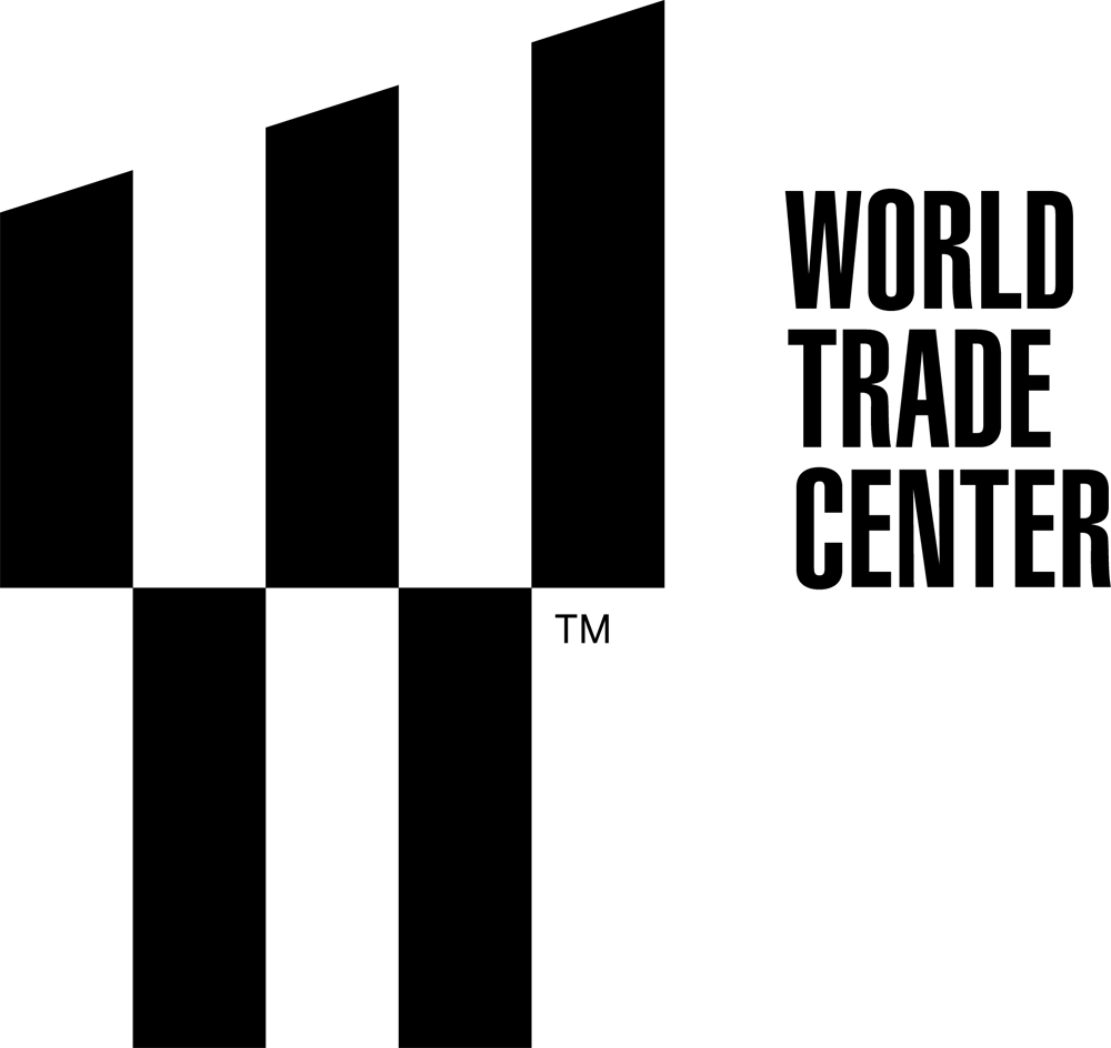
Landor Associates Design World Trade Center Logo
Back to BlogsThe World Trade Center has a new logo designed by Landor Associates, a corporate identity firm that has branded big names like FedEx, BP, and Smirnoff Vodka. The branding was a $3.57 million venture.
According to the New York Times, symbolism includes:
- The Tribute in Light. The two spaces between the three fingers evoke the memorial beacons.
- The two lower rectangles, out of which the symbolic pillars of light rise, depict the memorial pools that mark the footprints of the Twin Towers. These two rectangles are also the same shape, recalling the original towers.
- The five new towers. The logo’s five bars each stand for one of the towers in the new complex.
- W. Not only does this represent “World Trade Center,” but also, the Times notes, Westfield World Trade Center, the name of the shopping center that the development will hold.
- The symbolic 1,776-foot height of One World Trade Center. The slope of the top three prongs is at a 17.76-degree angle.
The typeface used in the combination mark is Helvetica Ultra Compressed typeface. I feel like it is the perfect typeface for the design. The condensed letters create a sense of strength and boldness.
I’m still undecided on the symbol itself. I appreciate the architectural quality and the minimalist, almost Bauhaus-inspired, design, but it still feels a little void of something. I can’t put my finger on it, but it feels slightly hollow for an iconic design. Plus, I can’t shake the 80s pixel feeling which makes it feel dated.
What do you think of the new design?
